
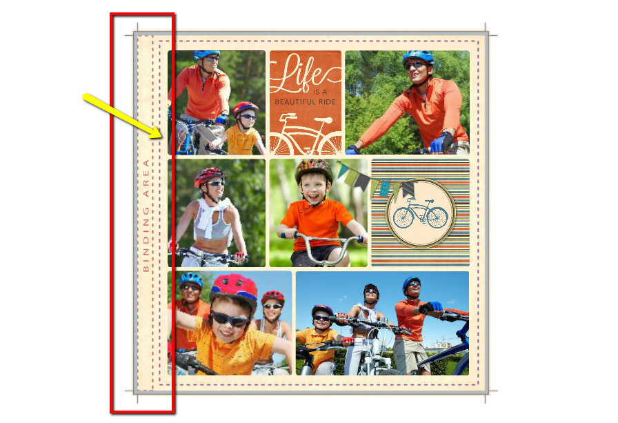
The design guide in Studio can be a great resource for knowing where to keep your important design elements to ensure that they don't run into the binding area, or "gutter", or get accidentally cropped off during production. But you might be surprised to find out that, when it comes to the gutter area, the design guide is quite liberal in where it depicts the "safe zone."
For further technical information about the gutter area of the design guide while designing in Studio, please click here or go to https://heritagemakers.zendesk.com/entries/22428002-Design-Guide-Understanding-Storybook-Binding-Area-Gutter
Hardbound Storybooks

As part of the Design Guide in Studio, you will see the "Binding Area" (shown with a red dashed border) and the overall "Safe Zone" of the page (shown with a purple dashed border). In the screenshot above, you can see that none of the important page elements, like photos or text, extend into the section marked as the "Binding Area." This gives you the assurance of knowing that these elements will be easily visible on the page, without extending too far into the curve of the page's gutter.
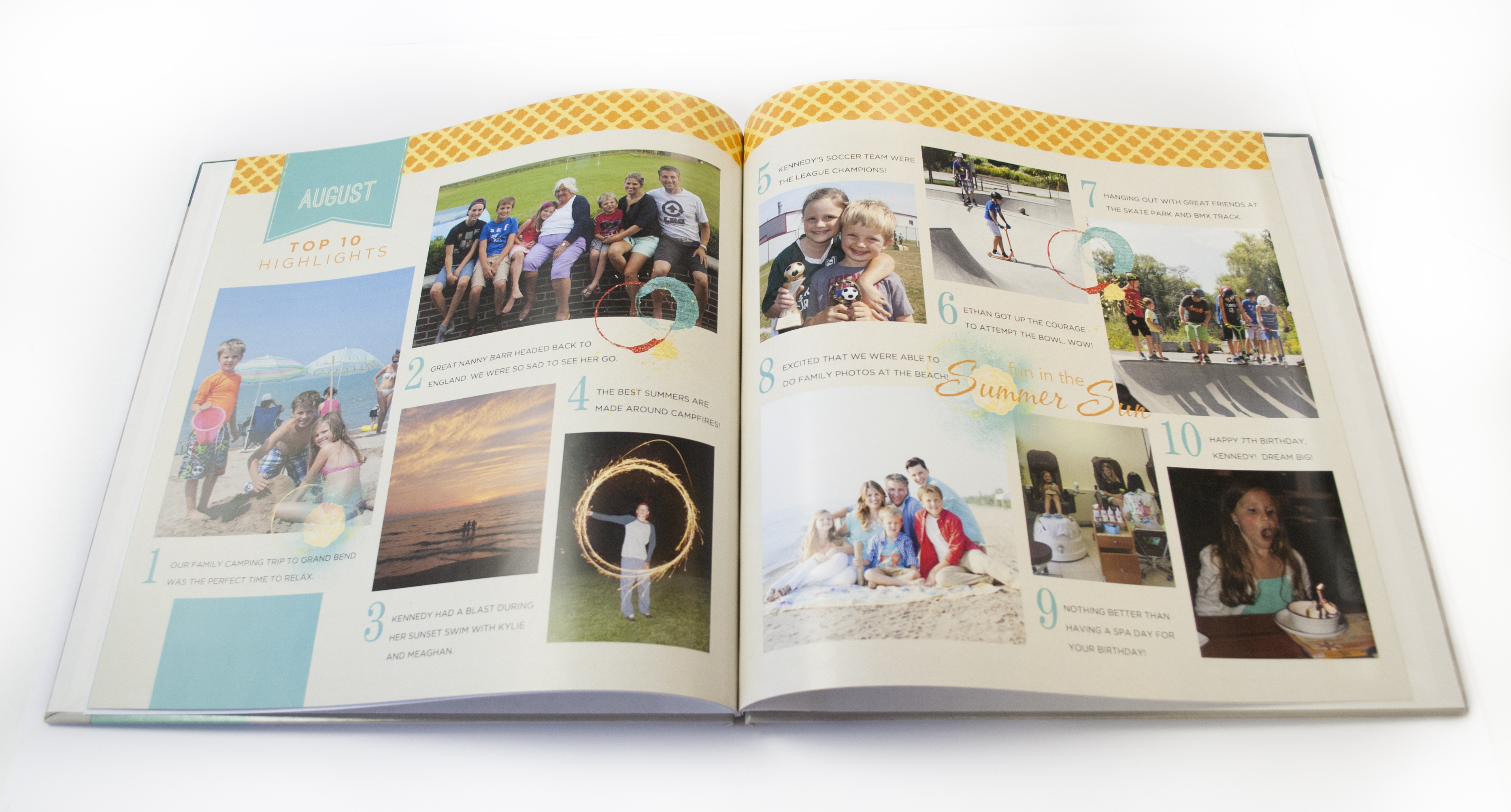
This is what that page looks like in the finished book. As you can see, the elements are easily visible with the page laying flat. All of the elements have adequate space, without extending into the curve of the gutter.

This is the same view of the Design Guide in Studio, but on a template that was created before the Design Guide was added. The layout does not add extra space to account for the gutter area of the page. If you open a template in Studio or create a project from scratch that extends into the gutter like this, should you be worried? Take a look at the pictures below and let's find out.
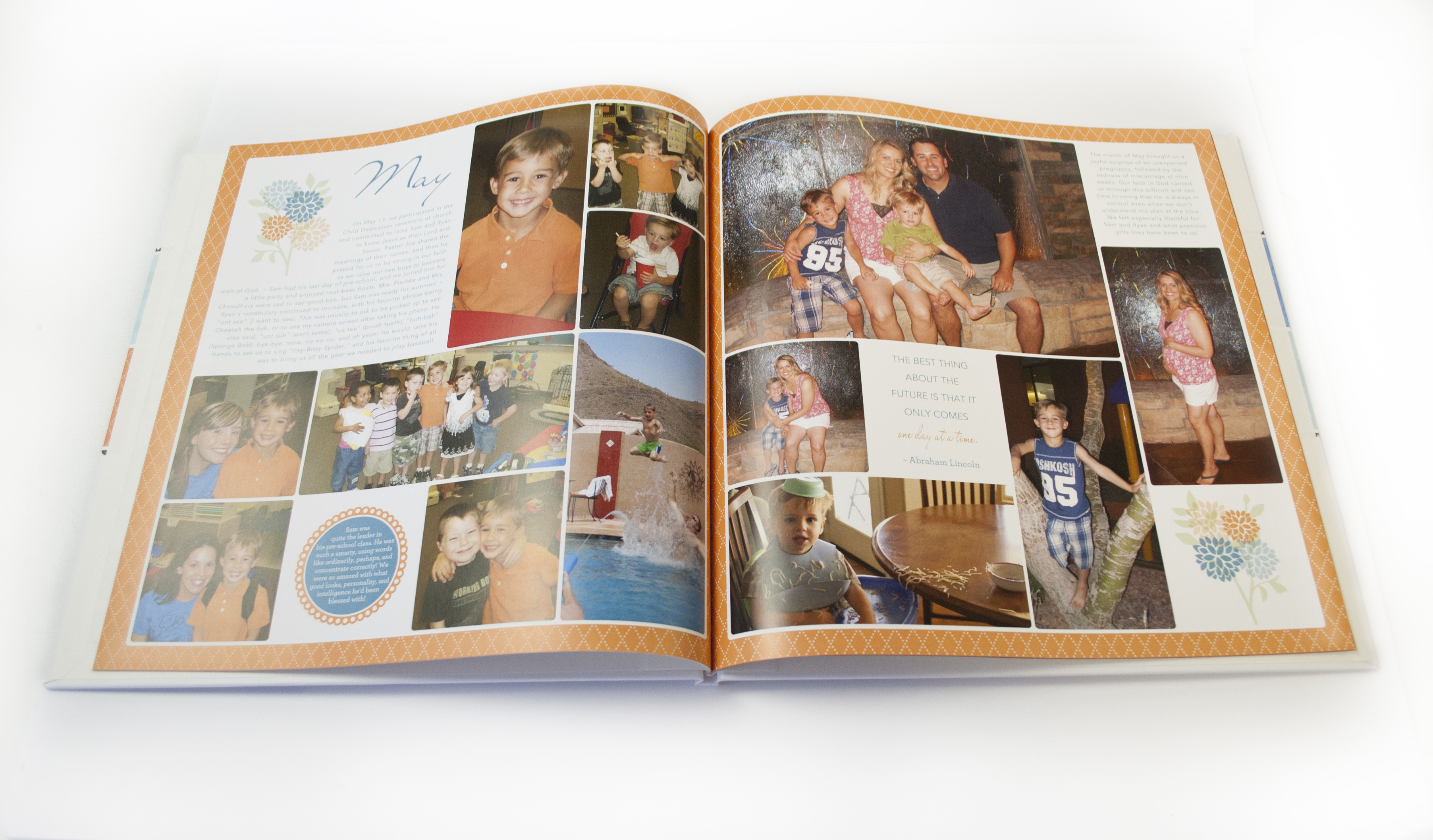
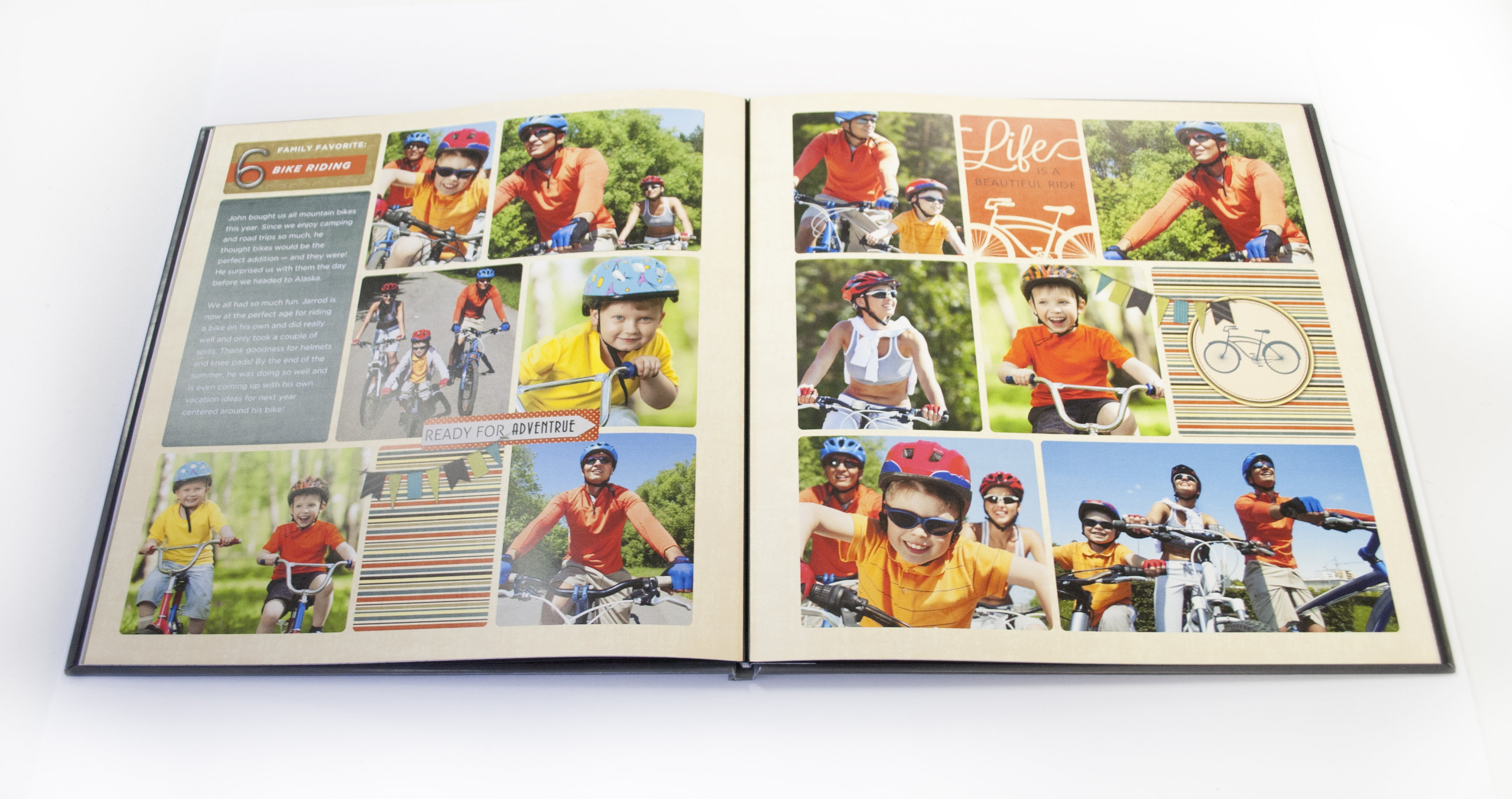
The "Binding Area" of the Design Guide, as mentioned at the beginning of this article, shows a very liberal amount of space for the gutter of a book. This template was designed with no additional space added for the gutter area of the page, but you can still easily see the orange border and there is no visual problem with the layout of the page as it curves into the gutter area.
There is definitely an aspect of personal preference with how far into the gutter area you are comfortable designing. It also depends on the overall style of your page. The first spread that was shown has a lot of "white space" in the design, so it looks nice to have empty, or "white space", in the gutter area. This spread is very neat and precise, with not much space between the photos. So, it fits nicely that the photos appear to almost touch in the gutter area of the spread.
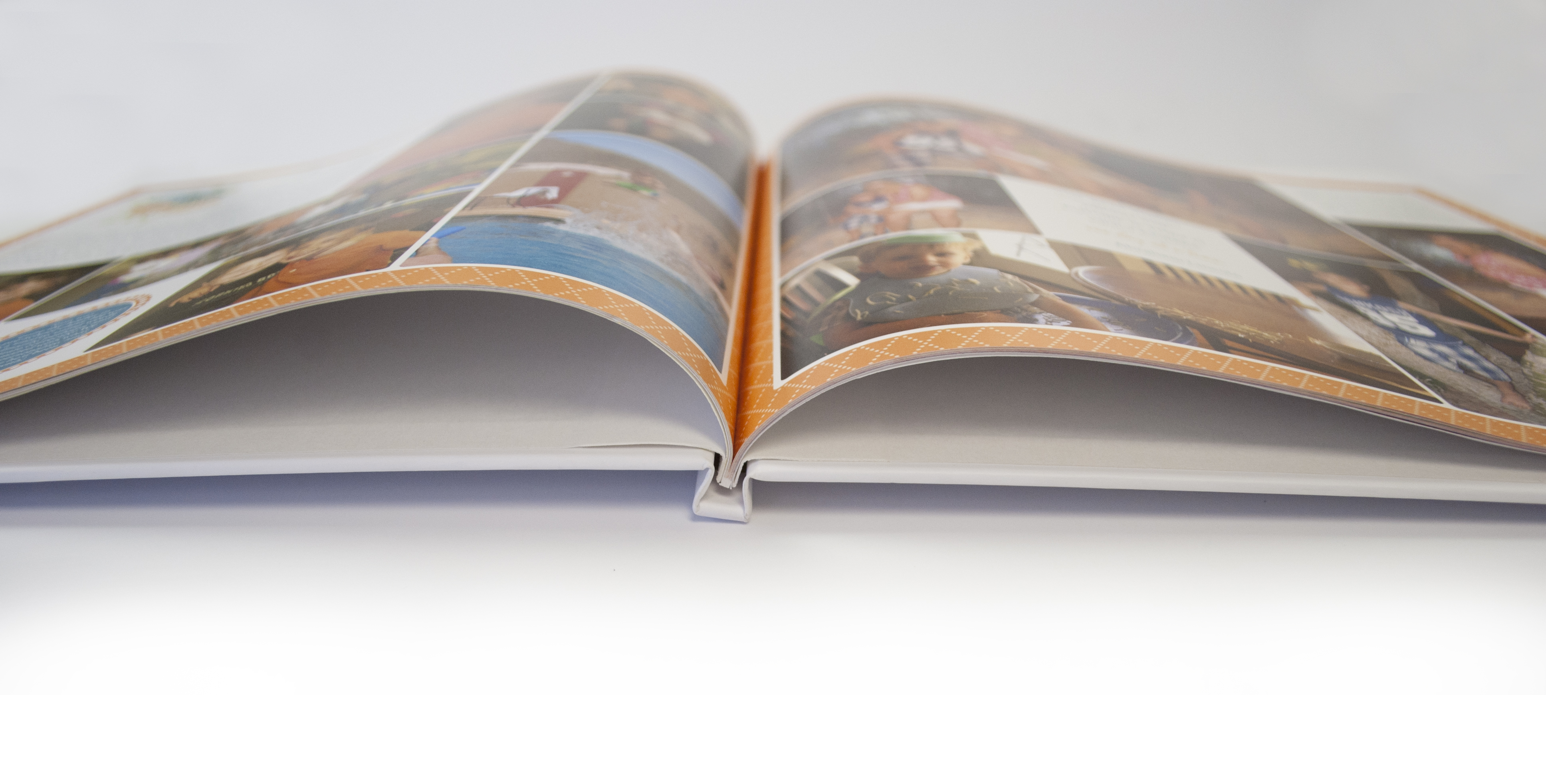
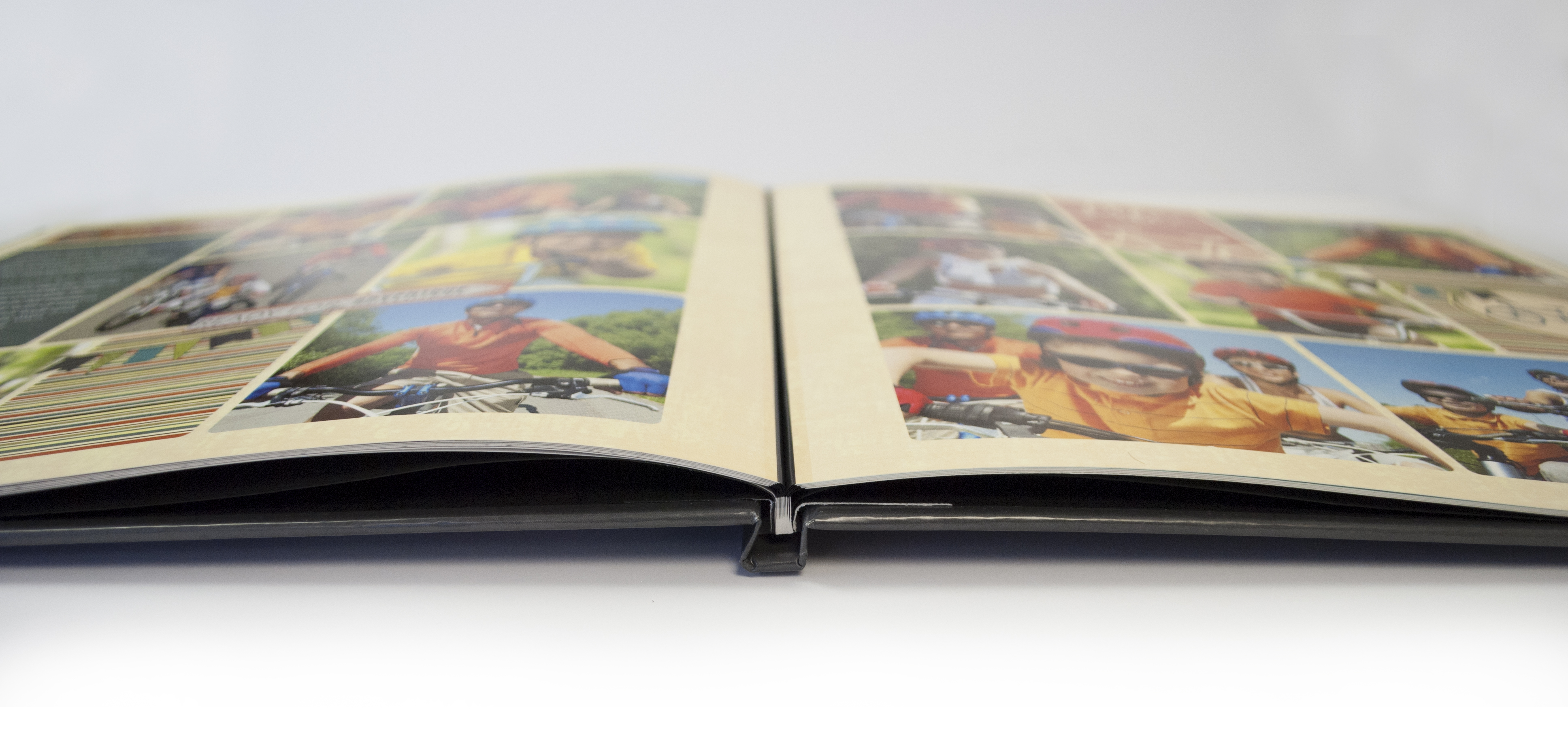
Here is a view of this same spread from the bottom of the book, looking directly into the gutter. Notice that you can clearly see much of the orange border in the gutter of the page. Nearly everything that you can see in Studio will be visible in your finished hardbound book, with only a small amount at the inside of the gutter area truly being hidden. But, if you design into the marked "Binding Area", your items will likely extend into the natural curve of the gutter.
Lay-Flat Storybooks
What about the Binding Area when designing a Lay-Flat Storybook? Our Lay-Flat Storybooks, due to the different way of binding, have a very different type of gutter than our standard Hardbound Storybooks.
When designing a Lay-Flat Storybook, you will see roughly the same Design Guide as you would see in a standard Hardbound Storybook. Please note that you do not need to strictly follow the guidelines of the "Binding Area" in a Lay-Flat Storybook, as you will see below.
In a finished Lay-Flat Storybook, the gutter area is a thin black line between the two pages. This black strip is essentially the page's "hinge." It allows the pages to lay flat, without a curved gutter area. It is important to keep important elements 1/8 of an inch away from the center gutter of a Lay-Flat Storybook, just as you would around the other three edges of the page in any Storybook.
The amount of visual spacing, if any, that you design on your pages in a Lay-Flat Storybook is entirely up to your personal preference. Notice that the spread shown above has a large amount of "white space" designed into the binding edge of each page, so that there is a large visual space between the two pages in the finished book.
Here is a view of this spread at the same angle as the standard Hardbound Storybook that was shown above. You can see the difference in the binding style and how it affects the gutter area of your book.
* Watch this great video from our July 11, 2013 Studio U class that teaches about the wraps, bleeds, gutters, and guides in Studio.*
0 Comments